
Friday, 30 March 2012
Thursday, 29 March 2012

Wednesday, 28 March 2012
Saturday, 24 March 2012
The Whole Digipak Finished

This is my finished digipak, the top covers are what the digipak would look like from the front when it is fully opened out. The bottom covers are what the digipak would look like from the front when it is fully open. I am happy with how my digipak looks and feel that it all looks as though it belongs together. And it all ties together with my music video and my magazine advert.
Thursday, 22 March 2012
DVD Side of the Digipak Draft 2

I have added in text for my DVD cover side of the digipak, I like how the text looks with the image, and I think like all my products the contrast of the DVD being ni colour to the CD being in CD really works and it represents the actual music video as that starts in black and white then goes into colour. The text is white with a black background, which is similar to the front of the digipak, and it looks professional, as well as makes sure that the buyer can read the text clearly. I think that I will keep my DVD cover like this. And like my CD side of the digipak when the DVD disc has been removed from the digipak the same image will be behind it but without the text. I have again left a spine to show that it is part of a digipak and to show where it will be, the far right of the inside of the digipak.
Wednesday, 21 March 2012
DVD Side of the Digipak Draft 1

For my DVD cover side of the digipak I have used an image from the actual music video, I chose to use an image with the artist holding his guitar as it shows that this disc can be related to visual performance. Although the song I chose uses mainly piano, many other songs use guitar and I think it represents him as an artist really well. Like my CD I think I will be adding some text, such as 'Music Video' to inform buyers that this one contains the music video and not just music.
Monday, 19 March 2012
CD Side of the Digipak Draft 2

This is my CD cover with text, I like how the text looks on top of the image and that this is what the CD will look like, when the CD is not in the digipak the same image behind will be there but without the text. I think that this will be my finished CD cover, and this will be the middle part of the whole digipak. I wont be changing anything to this as I think it looks like a finished product and it again goes will all of my digipak really well, as well as the music video and the advert.
CD Side of the Digipak Draft 1

This is going to be the image that is on the CD and the cover behind it, The face of the artist will be on the actual CD for the digipak, and the same image will be behind it so that even when the CD is taken out of the digipak you can still see the same image and see the artist. The white circles are representations of the actual CD. I like how this looks as I've used the same image as the front cover and made it black and white as well, this helps know that the CD belongs to that digipak. I think that I will add some text onto the CD, such as the artists name and the album/digipak name, further linking the CD to the rest of the digipak. And again I have put in where the digipak would fold and the spines that would be there.
Friday, 16 March 2012
Magazine Advert Draft 4

This is going to be my final magazine advert. The position of the digipak cover and the date of its release are where I planned to put them again, I have changed to size of both to make them slightly bigger, and put to text into the artists shadow around where the mouth would be, which is like the artist is telling the audience of the release. I am happy with how this looks and think it promotes both the artist and his digipak, with the music video very well, as well as using features that link it well to the digipak and the music video.
Magazine Advert Draft 3

This is another draft of my magazine advert for my digipak, I have changed the location of the digipak cover and the coming out date. I like it in both places but I think that I prefer it underneath the heading of the magazine, as it is like saying the name of the album/song then featuring and showing the audience the cover of the digipak so they know what to look for, then showing the name of the artist so they know who to look out for. So I think that I will move the digipak cover to the top again, but I might change the size to be a bit bigger, and change the size of the 'coming out' text to be bigger too, to make sure the audience can see it properly.
Outside Cover of Digipak

This is the cover that when the digipak is fully open would be on the outside along with the front cover and the back cover. I have again left a spine to indicate where the digipak will open out. I have done a collage of pictures of the artist on this cover, the pictures are a mixture of screen shots from the music video and images that were used for my auxiliary tasks. I think this works well in my digipak as it links all three of my products together and it is a common feature in digipaks/albums, it promotes the artists face, so that the audience can recognise the artist. I think that this looks good and I will be keeping this how it is and be putting it as part of my digipak.
Thursday, 15 March 2012
Magazine Advert Draft 2
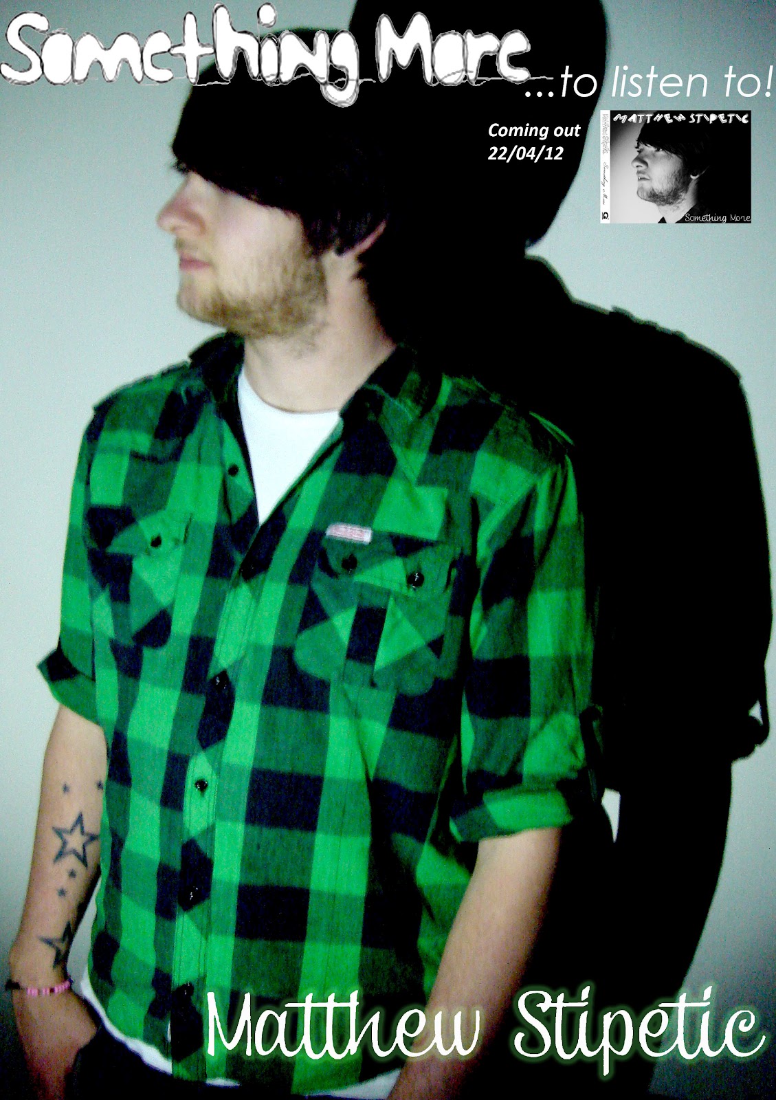
This is another draft of my magazine advert, I have added an image of the front cover of my digipak, as well as the date of which it would be released. This makes it more recognisable as an promotion for the album/digipak, making it more effective as a promotion product. I like how this looks and may keep the layout as it is but I think I will move the cover of the digipak and the date around to try different things.
Tuesday, 13 March 2012
Inside of Digipak Draft 3

I have changed the colour of the text for this and I think that it looks a lot better in green than it did red. It fits better with the pictures and the rest of my digipak, the advert and my video. I will be keeping this page as it is, as I feel it looks good like this. I may take the idea of using pictures of the artist to create the other outside cover that will be next to the back cover of my digipak, by doing a sort of collage of images, using images from the advert, digipak and the music video, further promoting and linking my products.
Inside of Digipak Draft 2

This is another draft of the inside cover of my digipak, like I planned to I have added in text, something that is written like the artist has wrote it himself, giving the digipak a more professional feel as well as a personal feel, like the artist is bothered about communicating with his fans and showing that he is bothered about sending a message to his fans. He is talking about how he started with playing instruments and singing, to writing his own material, to being signed by a record company, onto being a famous artist and living his dream. I have done the text in red as it could represent relationships which is what he explains as some of his influences, but I might change the colour of the text to green, as I feel this works better with the rest of the digipak as well as linking it further to the other products I have used. I feel it will go well with the one coloured picture on this cover also.
Monday, 12 March 2012
Inside of Digipak Draft 1

This is my frist draft of one of the inside covers of the digipak, the very inside cover that will be along side the CD and DVD covers. I will be adding some text under the pictures on this page, this is often a convention used with digipaks. Having different pictures of the artist along with some information about them as well, such as when they started, their label, their influences etc, and this is what I intend to write on this. I have also put in a line, indicating where a spine would be, as in where the digipak would bend.
Friday, 9 March 2012
Cover of Digipak Final

This is my final draft of my front cover of the digipak, I like how it looks, especially in contrast to the back which is in colour and a extreme long shot of the artist, yet I think that it is still recognisable that all of my products go together well. I added in the information for the spine of the digipak, and I feel that this gives it a more finished and professional look to the cover, making it more believable as a real product.
Cover of Digipak Draft 2

This is another draft of my digipak cover, like I wanted to do I have put the image in black and white, I feel that this works with they way the music video is, and is a good contrast to the rest of the digipak that will be in colour. Like the back of my digipak I need to add in the spine and the contents that will be featured on the spine, which will be the same as shown on the back of my digipak. I also kept the image in its original layout, whereas in the other draft of my cover I had flipped the image so that the artist was facing the other way, but I feel that this works well.
Cover of Digipak Draft 1

This is a draft of my cover of my digipak, I like the fonts and the image, but I think that I will be trying out different layouts and maybe a different image for the front cover, I might do the front cover in black and white as this is how my video begins, with the artist in black and white. I think that this could be a good way of ensuring that it is easy to link all three of my products together and to know that they are related.
Thursday, 8 March 2012
Back of Digipak Draft 1

This is the back of my digipak, I have also included a spine with the artists name, album name/song name and the record company assigned to. I decided that it would look good to use a imagine from my actual music video, which makes it look more professional as well as makes sure that the digipak looks as though it belongs with the music video and the magazine advert. I also added other songs, as this is a convention that is featured with albums, I felt that it made my product look more realistic and professional.
Tuesday, 6 March 2012
Magazine Advert Draft 1

This is my first draft of my magazine advert, I have edited the image itself to give the effect of a hard shadow behind, like in my video, to be more dominant, and to give the image a better quality and colour. I thought I would play around with the name of the song/album by adding '...to listen to' as it references the name of the song in a way that tells the audience that there is something more for them to listen to as this is his newest stuff, as well as suggesting that there will be more to come as well. I have featured the name of the artist also as it ensures, like my analysed magazine adverts, that the audience notice and remember the name of the artist, further promoting.
Subscribe to:
Posts (Atom)